Average Flat Prices
Let’s say we plan to buy a flat in London in ‘N13 4’ postcode sector. With Plumplot interactive analytics we can analyze this sector in more details:
- Type ‘N13 4’ in the search field, hit enter.
- Select ‘flat’ from the filter menu.
- Click on the sector with a black border.
‘N13 4’ house card pops up.
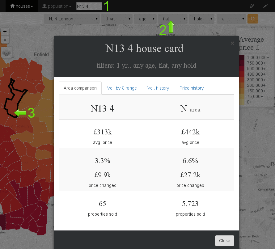
The first tab ‘Area comparison’ of the house card compares selected postcode sector (or postcode district) - ‘N13 4’ to its postcode area (N).
We can see that an average flat price in the previous twelve months was £313k. ‘N’ area is a bit more expensive with an average price of £442k. On the price map we can visually compare this sector with others.
In the last 12 months, price grew slower in ‘N13 4’ (3.3%) than in N postcode area (6.6%). However, growth is taken from 65 properties. The volume of sold properties is too low. When determining price growth, the volume should always be at least 100 properties (better 500).
Price dynamic is better seen on ‘Price’ tab in the popup menu which compares price dynamics to national average price since 1995. On the other tabs you can also see sold properties in a given price range. Number of transactions can be seen on other map (see the next page).
You can also see how ‘N13’ correlates to other ‘N’ areas
- select
houses»price % change, avg. pricedashboard.
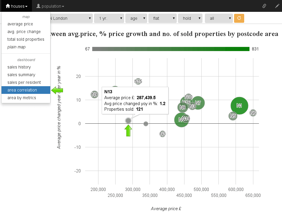
By zooming in the graph, you can find out that ‘N13’ district is one of the cheapest districts in ‘N’ area. It’s the one with the lowest price growth. However, not many flats are sold in this district (the circle is relatively small compared to other circles).