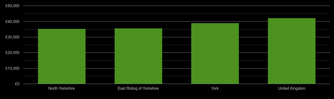
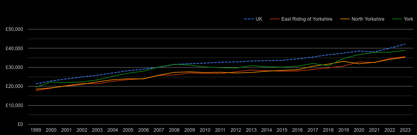
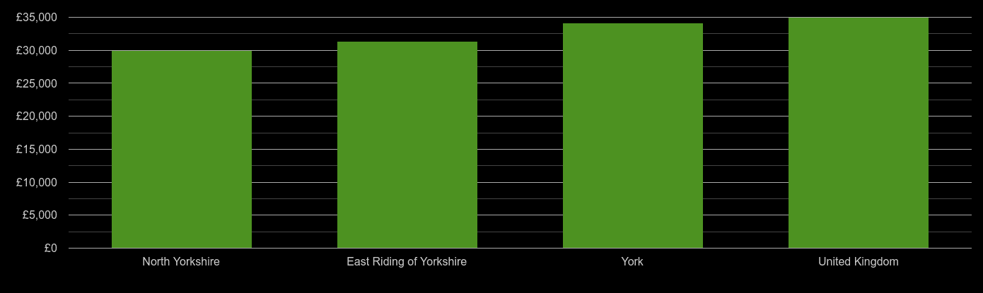
York average salary comparison
The average salary is ranging between £40.4k in North Yorkshire and £45.9k in York. The UK average salary was £48.5k in 2025. Gross average salary is calculated for full-time employees. Employee has to be in the same job for over 12 months. The data collected is Tax Year Ending. The income includes incentive payments and are available for local government districts/counties.Full-time Employee Average Salary Compared to UK Average in York Nearby Areas| Local authority | Average salary in 2025 |
|---|
| North Yorkshire | £40.4k |
| East Riding of Yorkshire | £40.4k |
| York | £45.9k |
| United Kingdom | £48.5k |
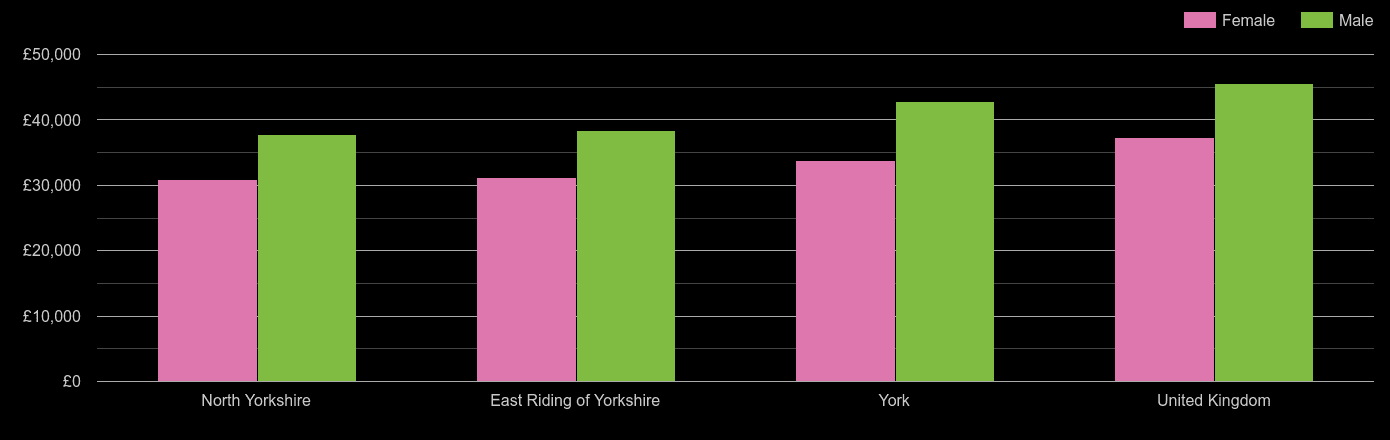
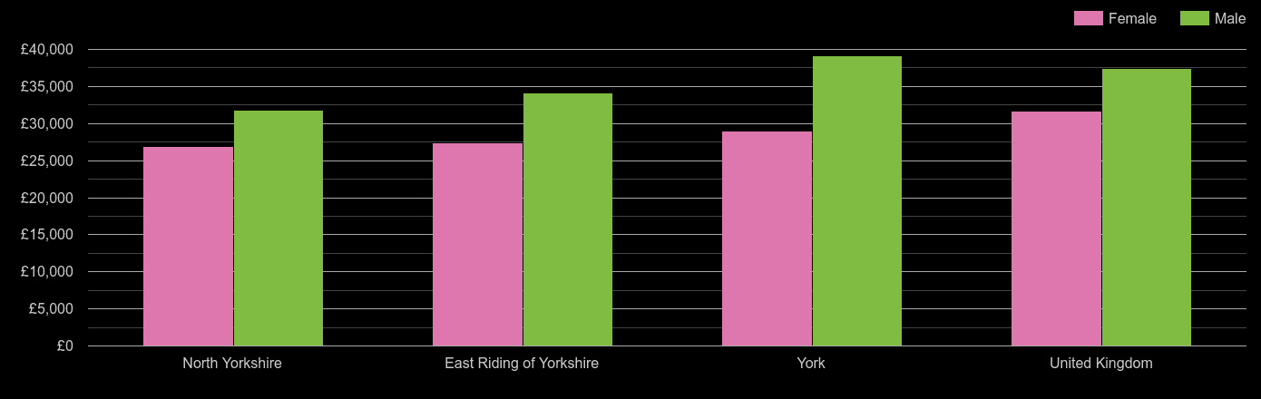
York average salary comparison by sex
The average salary for female is ranging between £35.9k in North Yorkshire and £40.3k in York. The UK average salary for female was £42.6k in 2025. The average salary for male is ranging between £43.1k in North Yorkshire and £50.1k in York. The UK average salary for male was £52.8k in 2025.Full-time Employee Male and Female Average Salary in York Nearby Areas Compared to UK| Local authority | Female average salary, 2025 | Male average salary |
|---|
| North Yorkshire | £35.9k | £43.1k |
| East Riding of Yorkshire | £32.6k | £46.2k |
| York | £40.3k | £50.1k |
| United Kingdom | £42.6k | £52.8k |
York median salary comparison
The median salary is ranging between £34.8k in North Yorkshire and £39.3k in York. The UK median salary was £39.0k in 2025.Full-time Employee Median Salary Compared to UK Median Salary in York Nearby Areas| Local authority | Median salary in 2025 |
|---|
| North Yorkshire | £34.8k |
| East Riding of Yorkshire | £35.0k |
| United Kingdom | £39.0k |
| York | £39.3k |
York median salary comparison by sex
The median salary for female is ranging between £30.6k in North Yorkshire and £34.3k in York. The UK median salary for female was £35.7k in 2025. The median salary for male is ranging between £37.0k in North Yorkshire and £45.3k in York. The UK median salary for male was £41.8k in 2025.Full-time Employee Male and Female Median Salary in York Nearby Areas Compared to UK| Local authority | Female median salary in 2025 | Male median salary |
|---|
| North Yorkshire | £30.6k | £37.0k |
| East Riding of Yorkshire | £29.1k | £38.8k |
| United Kingdom | £35.7k | £41.8k |
| York | £34.3k | £45.3k |
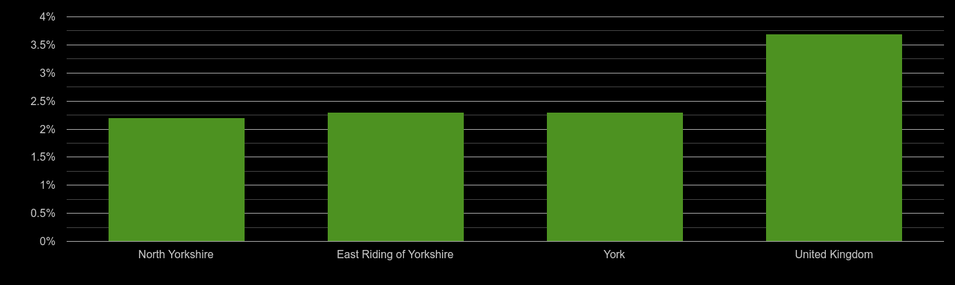
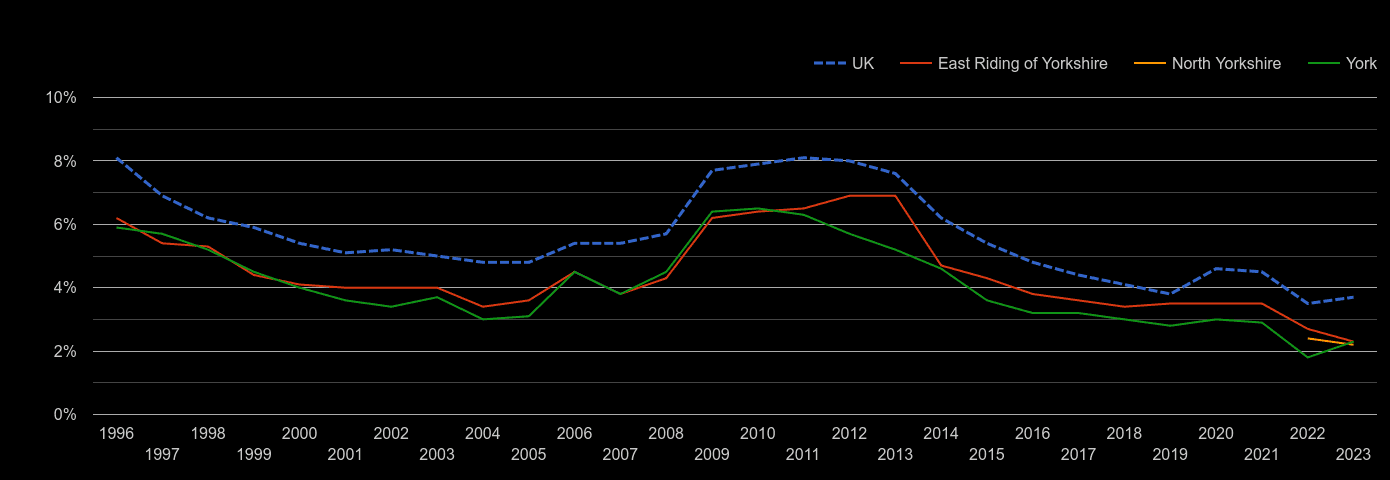
York unemployment rate comparison
The unemployment rate is ranging between 2.2% in North Yorkshire and 2.8% in East Riding of Yorkshire. The UK unemployment rate was 4% in 2025.Unemployment Rate Compared to UK Unemployment Rate in York Nearby Areas| Local authority | Unemployment rate in 2025 |
|---|
| North Yorkshire | 2.2% |
| York | 2.3% |
| East Riding of Yorkshire | 2.8% |
| United Kingdom | 4% |
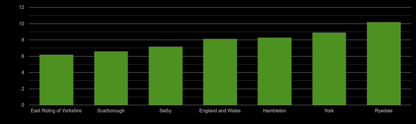
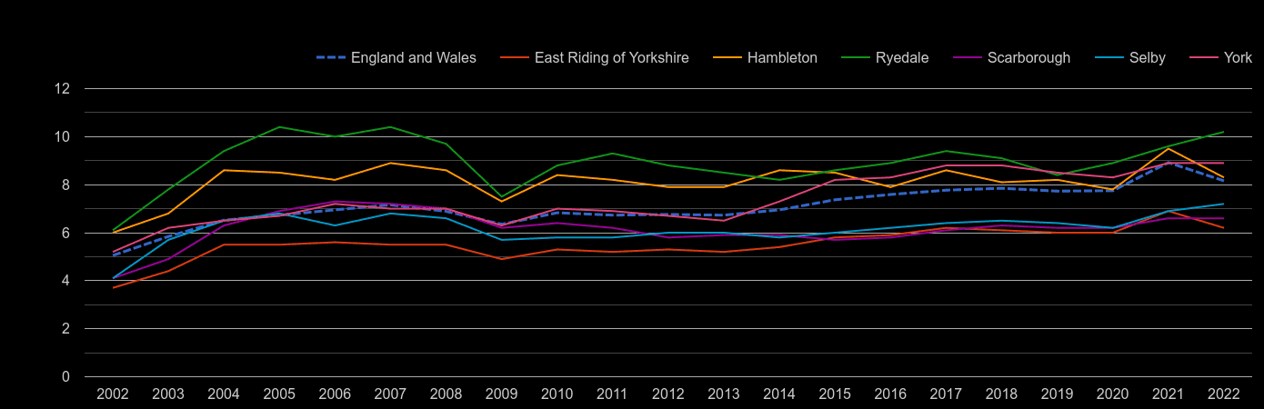
York house price to earnings ratio
The median property price to median earnings ratio is ranging between 6 in East Riding of Yorkshire and 8.5 in York. Ie. East Riding of Yorkshire resident with middle-income needs 6 gross annual salaries to buy a medium-priced property. Resident in York needs 8.5 annual salaries. The England and Wales ratio was 7.54 in 2024.Median House Price to Median Salary Ratio Compared to UK ration in York Nearby Areas| Local authority | Median house price / salary ratio in 2024 |
|---|
| East Riding of Yorkshire | 6 |
| North Yorkshire | 7.3 |
| England and Wales | 7.54 |
| York | 8.5 |
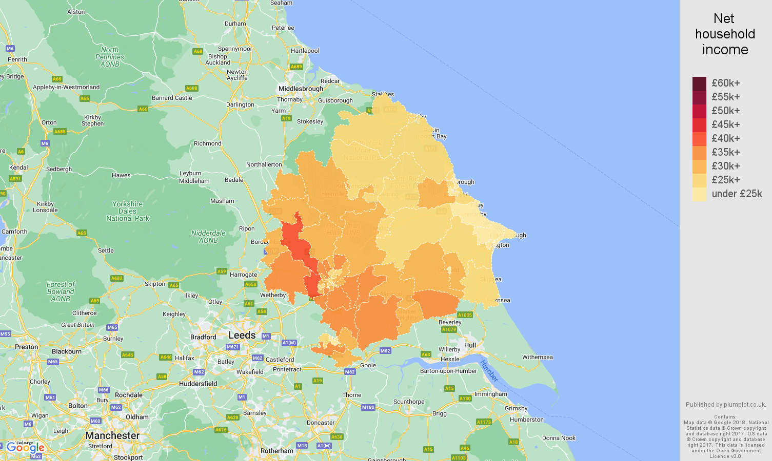
York net household income map
Map shows the net average household income in 2020 by middle layer super output area (MSOA). The lowest average net household income was in East Riding of Yorkshire 003, with £21.0k. The area with the highest average net income was York 011, with £39.6k. Median income was £32.5k - i.e. half of the areas had income equal or above £32.5k. Median income for England and Wales was 34.5k ( the lowest income was in Middlesbrough 001, £19.3k, the highest in Westminster 019, £67.0k).
The lowest, the Median and the Highest Household Income in York postcode area.| The lowest income | £21.0k |
| The median income | £32.5k |
| The highest income | £39.6k |
York working age population share
2024 population estimates.
44.3
York
average age40.8
England & Wales
average age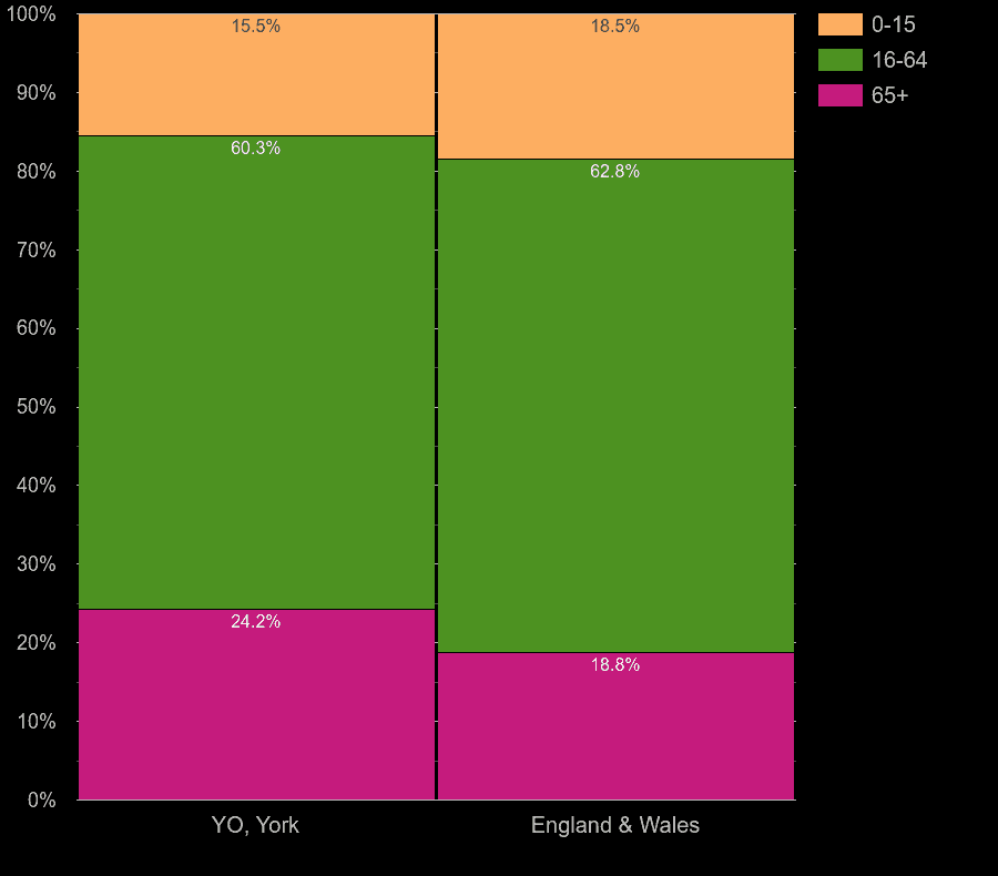
Population Distribution in York postcode area by Age Group vs. England and Wales| age group | head-count | % share of population | % for Eng & Wales |
|---|
| 0-15 | 91.6k | 15.2% | 18.3% |
| 16-64 | 363k | 60.3% | 62.8% |
| 65+ | 148k | 24.5% | 18.9% |
Next for York postcode area

 login →


